
The Context:
Course project for the Master’s level Fundamentals of UX (INF1602H) at the University of Toronto.
Team
Members:
Linda Hang, Stephanie Kang, Rebecca Ren, Jialing Wu, Yingying Xu
My Role:
Conducted exploratory research, analyzed competitor apps, identified user pain points through interviews, prototyped solutions, integrated feedback into design iterations, and co-facilitated usability testing. Specifically coordinated the creation of the homepage and the integration of the AI voice assistant feature.
Introduction
Core Problem
Dog owners often face challenges like outdated park information, limited details, and the hassle of switching between apps when searching for suitable parks for their pets. These issues lead to frustrating experiences, such as arriving at overcrowded parks with no shaded areas. Just Paws was created to address these problems and provide a seamless solution for pet owners.
Project Overview
Highlighted frustrations such as switching between apps, outdated information, and difficulty managing tasks while walking dogs.
The Solution
Defined features like AI assistant, real-time updates, and personalized recommendations.
Project Process
1
2
3
4
Research & Analysis
Understanding Dog Owners’ Needs
When designing Just Paws, the journey from research to implementation revealed not just the problems dog owners face but also the challenges and rewards of user-centred design. This project was not just about creating a polished app; it was about uncovering insights, iterating on ideas, and learning through every step of the process.
-Here’s the story behind it!
Exploratory Research
We created a structured interview guide to ensure consistency in our user interviews. The guide was designed to explore:
How users evaluate dog parks based on the information provided on the details screen.
The importance of real-time updates on crowd size and cleanliness.
Frustrations with existing solutions, particularly regarding navigation and information clarity.
Participants:
We recruited 10 participants aged 20-45 who regularly visit dog parks. All participants had experience using dog park locators or navigation apps.
Methodology:
Interviews lasted 15–25 minutes and were conducted in both urban and suburban settings. Participants were asked about:
Evaluate the importance of each feature (e.g., cleanliness ratings, live updates).
Provide feedback on the current experience.
Key Insights From User interview:
Navigation Challenges
Difficulty managing phone and leash simultaneously while navigating.
Lack of hands-free functionality
Switching between multiple apps
No integrated navigation within the app.
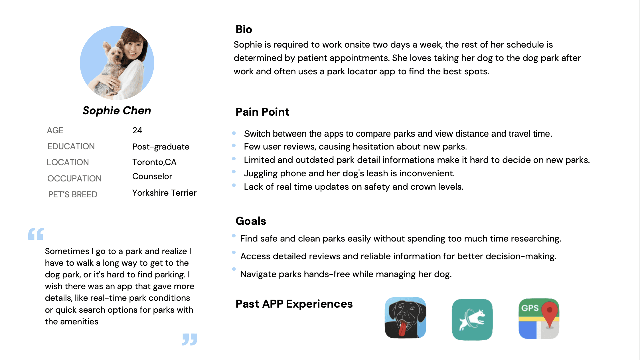
Persona
Approach:
Our team developed the persona Sophie Chen to represent busy professionals who prioritize safety, cleanliness, and convenience when visiting dog parks. As a team, we analyzed user interviews to identify key needs, such as real-time updates, intuitive navigation, and reliable park information, and incorporated these findings into Sophie’s profile.
My contribution focused on evaluating interview data to uncover major pain points, such as the inconvenience of juggling a leash while using navigation apps, and ensuring her goals and challenges were aligned with our app’s core features, like hands-free navigation and customizable filters.
Journey Map
Analyze Findings:
Together, we synthesized the interview data to identify pain points and patterns.
Through collaboration, we developed both the As-Is Journey Map (representing the current user experience) and the To-Be Journey Map (outlining an ideal, improved experience).
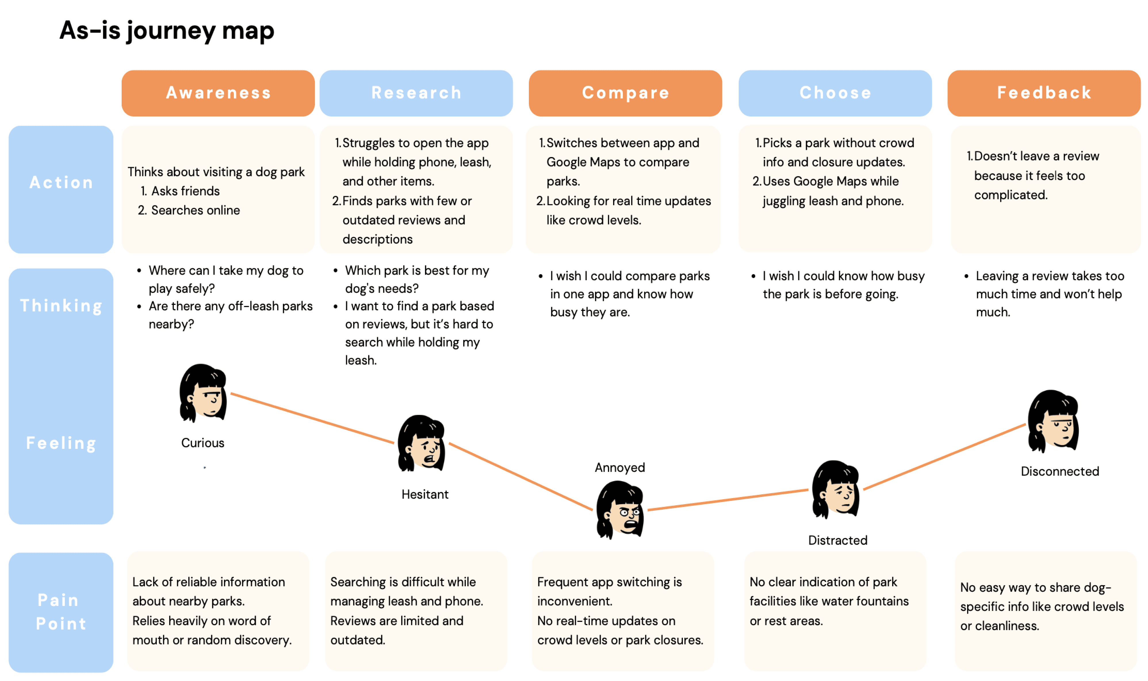
As-Is Journey Map: Highlighted frustrations such as switching between apps, unclear park details, and time-consuming searches.
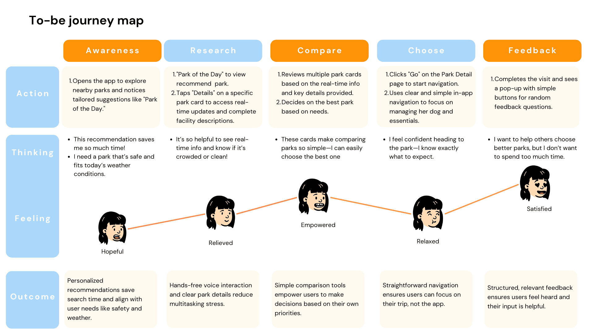
To-Be Journey Map: Visualized a seamless flow where users could quickly find parks with minimal manual effort, leveraging features like personalized recommendations and hands-free navigation.
Competitors Analysis
Our team analyzed five competing apps to identify gaps and opportunities for differentiation. Key findings included:
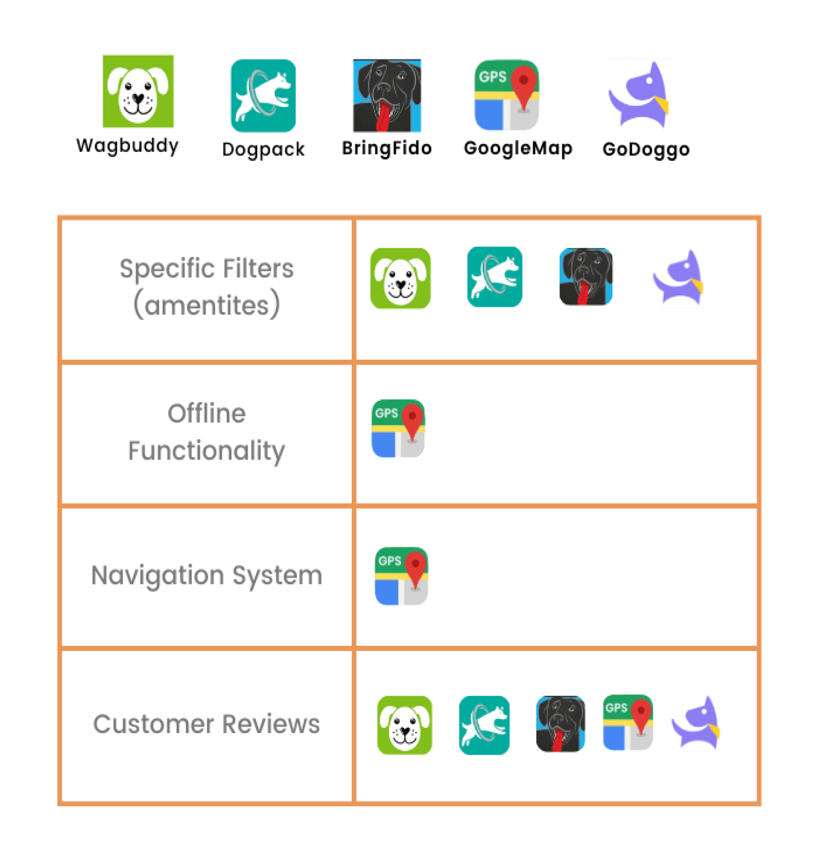
Unreliable User-Generated Content
Many competitors rely heavily on user updates for park facilities and conditions.
Low user engagement often results in outdated or inaccurate park information.
Lack of Hands-Free Functionality
Existing apps require hands-on interaction, which is inconvenient for dog owners juggling leashes, bags, or other items.
Ideation
Exploring diverse concepts
Act 1: Pioneering Unique Features
Following the realization that filters alone wouldn’t suffice, we brainstormed solutions that could address user needs more effectively. Through discussions and iterations, we identified two transformative features:
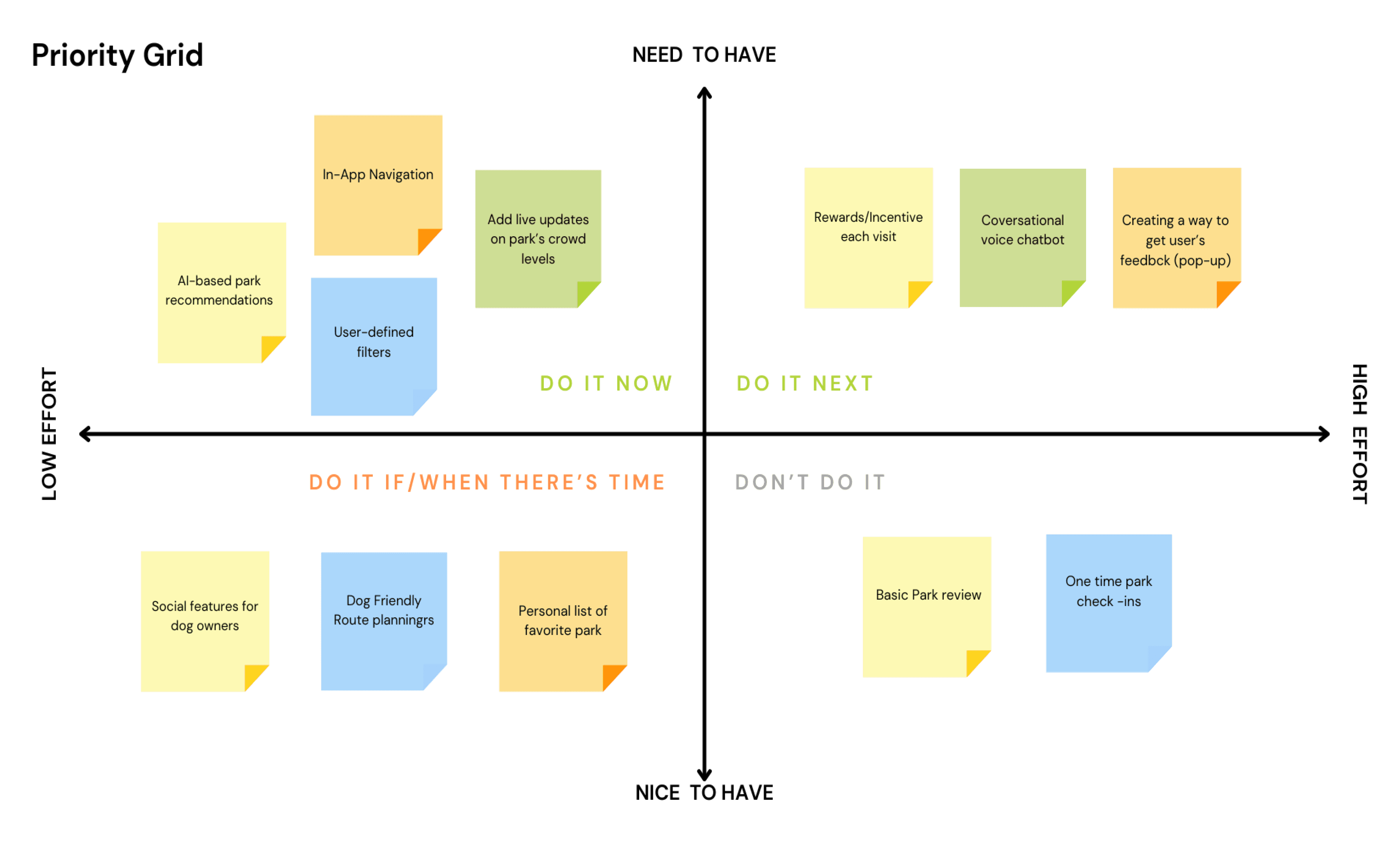
After much discussion, we identified two core features to redefine our app’s purpose:
Park of the Day: A curated park recommendation based on real-time conditions, user preferences, and weather.
AI Voice Assistant: A hands-free solution for park search and navigation, reducing distractions while managing pets.
With these features in place, we pivoted our design to focus on them as the new Happy Path.
I Developed a new user flow to integrate the Park of the Day feature seamlessly into the app, ensuring a smooth and intuitive user experience.
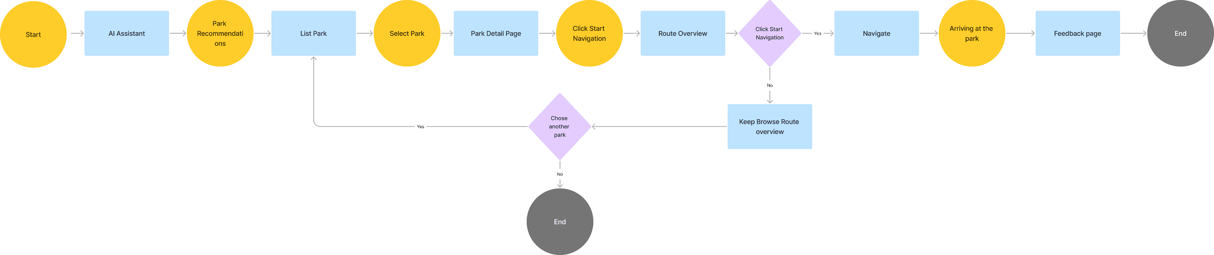
Users activate the AI assistant for hands-free interaction, and see Park of the day
Users view real-time information about cleanliness, crowd levels, and amenities.
Users use in-app navigation
After visiting, users leave feedback with star ratings and answer quick questions like “Was the park clean?”
Wireframes & Prototyping
I developed sketches focusing on the Happy Path, ensuring clear navigation and intuitive user interactions. I also contributed by providing feedback during the review process, helping to finalize the structure and logic of the sketches.
Our team began by creating low-fidelity sketches, with each member contributing designs for key screens. These sketches mapped out the flow for the finalized Happy Path. After collaboratively reviewing and discussing the sketches, we refined and consolidated the best ideas to ensure clear user flows and alignment with app objectives.
Sketches
To bring our ideas to life, we started with low-fidelity sketches, brainstorming and iterating on initial concepts while mapping out the flow for the finalized Happy Path.

Wireframe
Building on the sketches, the team worked on mid-fidelity wireframes to define the app's structure and functionality in more detail. This included streamlining layouts, incorporating usability testing insights, and designing cohesive app icons to ensure visual and functional consistency.
I contributed by refining the wireframes based on team feedback, aligning layouts with usability requirements, and ensuring consistency across screens. Additionally, I designed specific icons, such as those for the Assistant and Park of the Day, to enhance clarity and usability while maintaining the app’s visual style.
Usability Testing
Homepage:
Simplified the layout, adjusting the size of key elements like the AI Assistant card and navigation bar for better readability.
Route Overview: Streamlined the design to make navigation instructions and options more intuitive.
Overall Design: Optimized the size and spacing of icons and text throughout the app, enhancing visual clarity and usability.
Final Design
Visual Direction
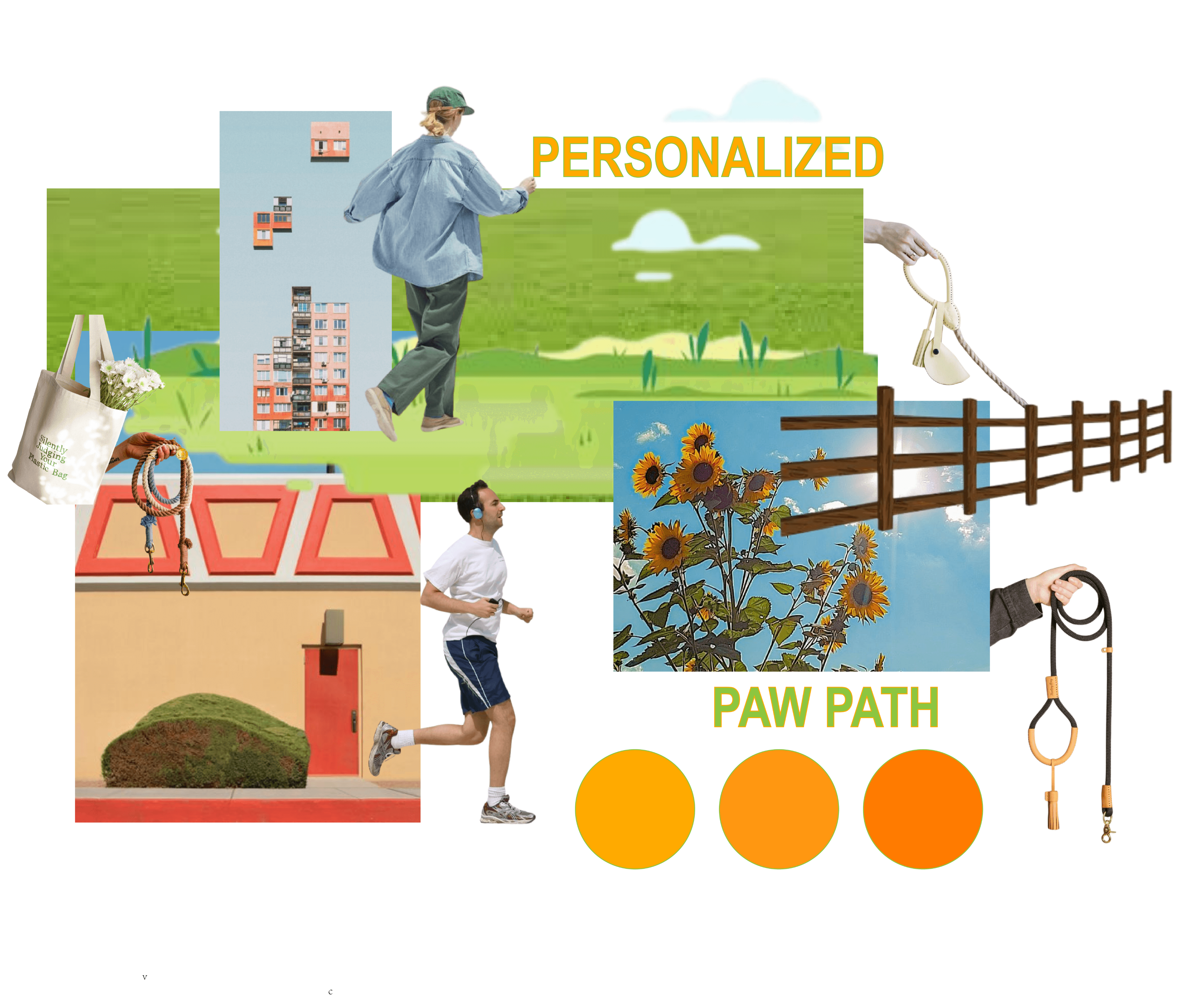
The mood board serves as the foundation for the app's design, inspired directly by our vision words:
Safe: Warm, natural imagery like fences and soft lighting to evoke a sense of security.
Engaging: Vibrant elements, including active runners and cheerful sunflowers, to capture energy and interaction.
Personalized: Thoughtful details like leashes and everyday pet-friendly items to connect with dog owners’ lifestyles.
Convenient: Clean and organized visuals that reflect ease and simplicity.
Reliable: Earthy tones and grounded compositions to communicate trust and dependability.
By combining these elements, the mood board reflects the app’s core purpose: to provide a stress-free, enjoyable experience for dog owners.
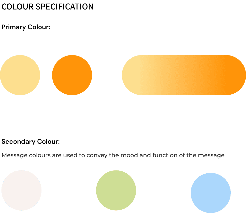
Colour & Typography

Final Screens
The final design of Just Paws reflects not just a polished interface but also my journey as a UX designer, shaped by iterative feedback, problem-solving, and a deep understanding of user needs.
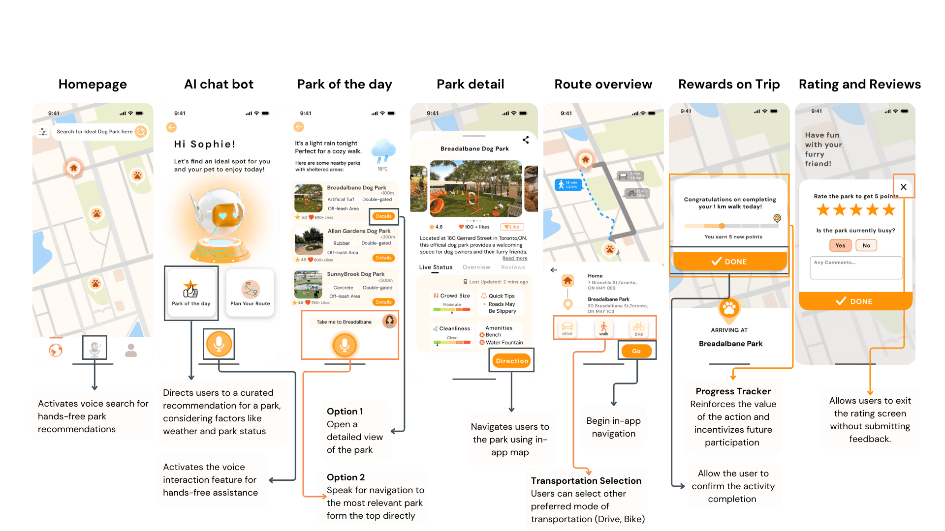
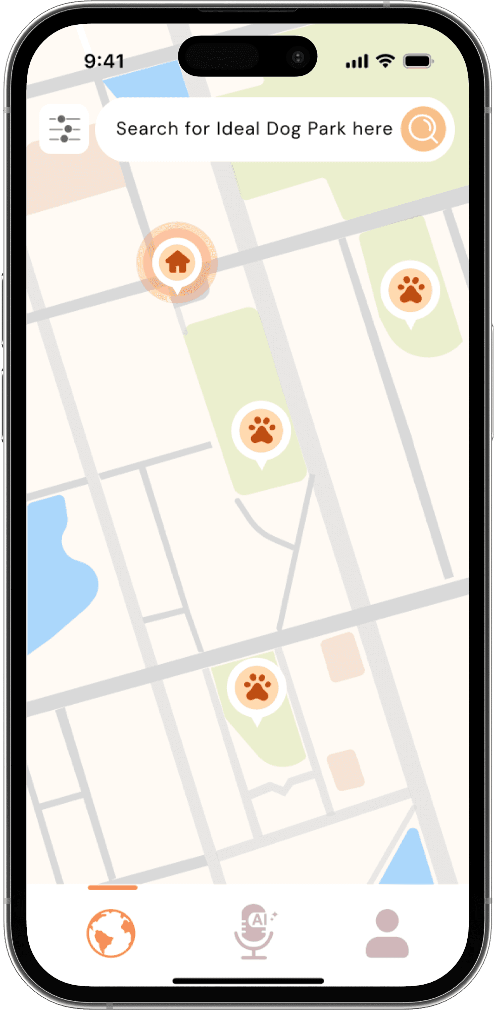
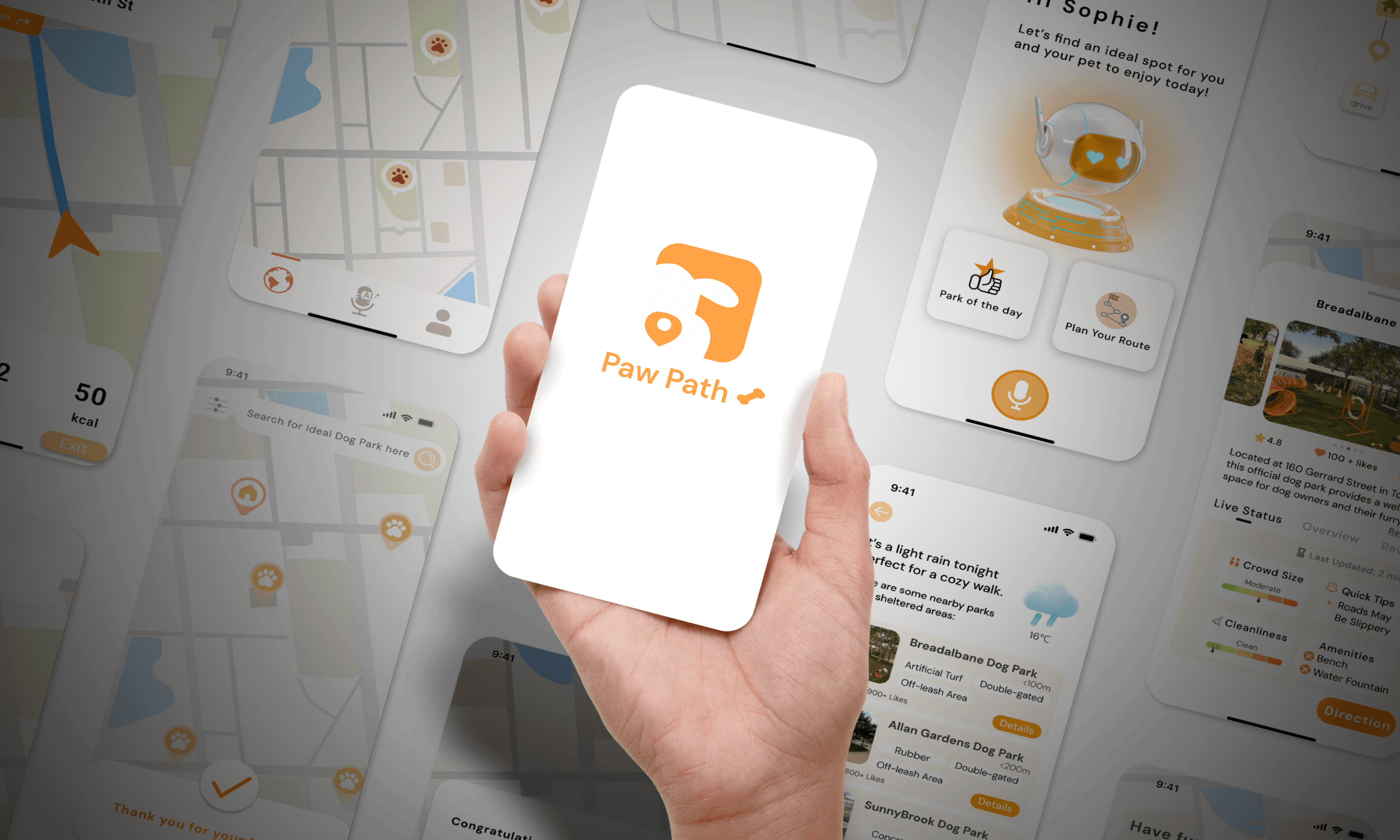
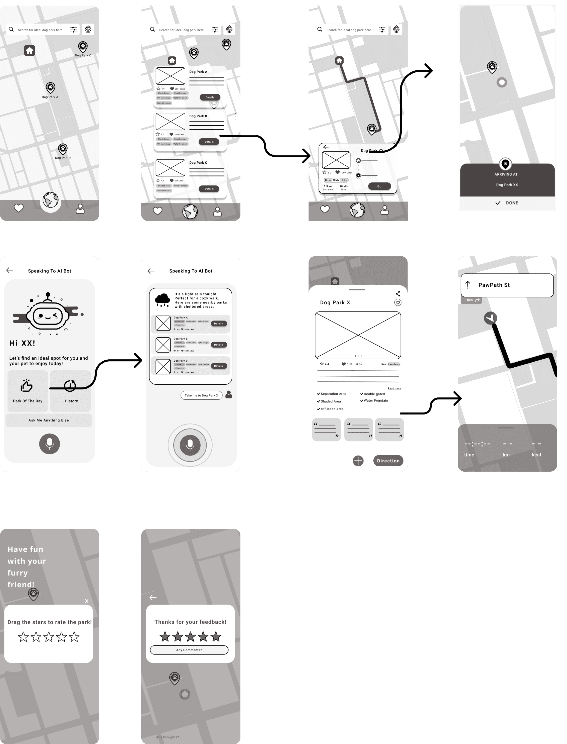
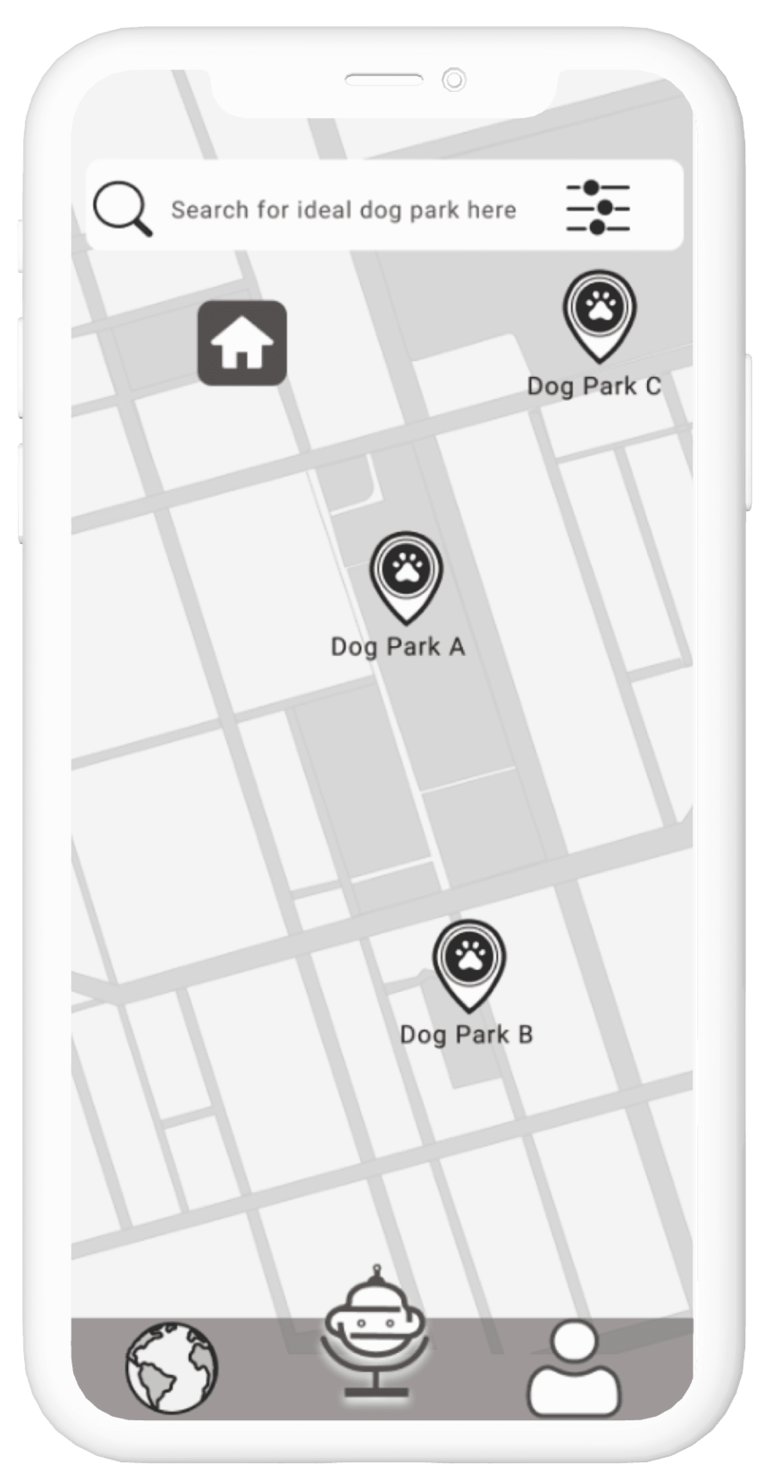
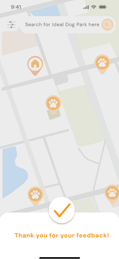
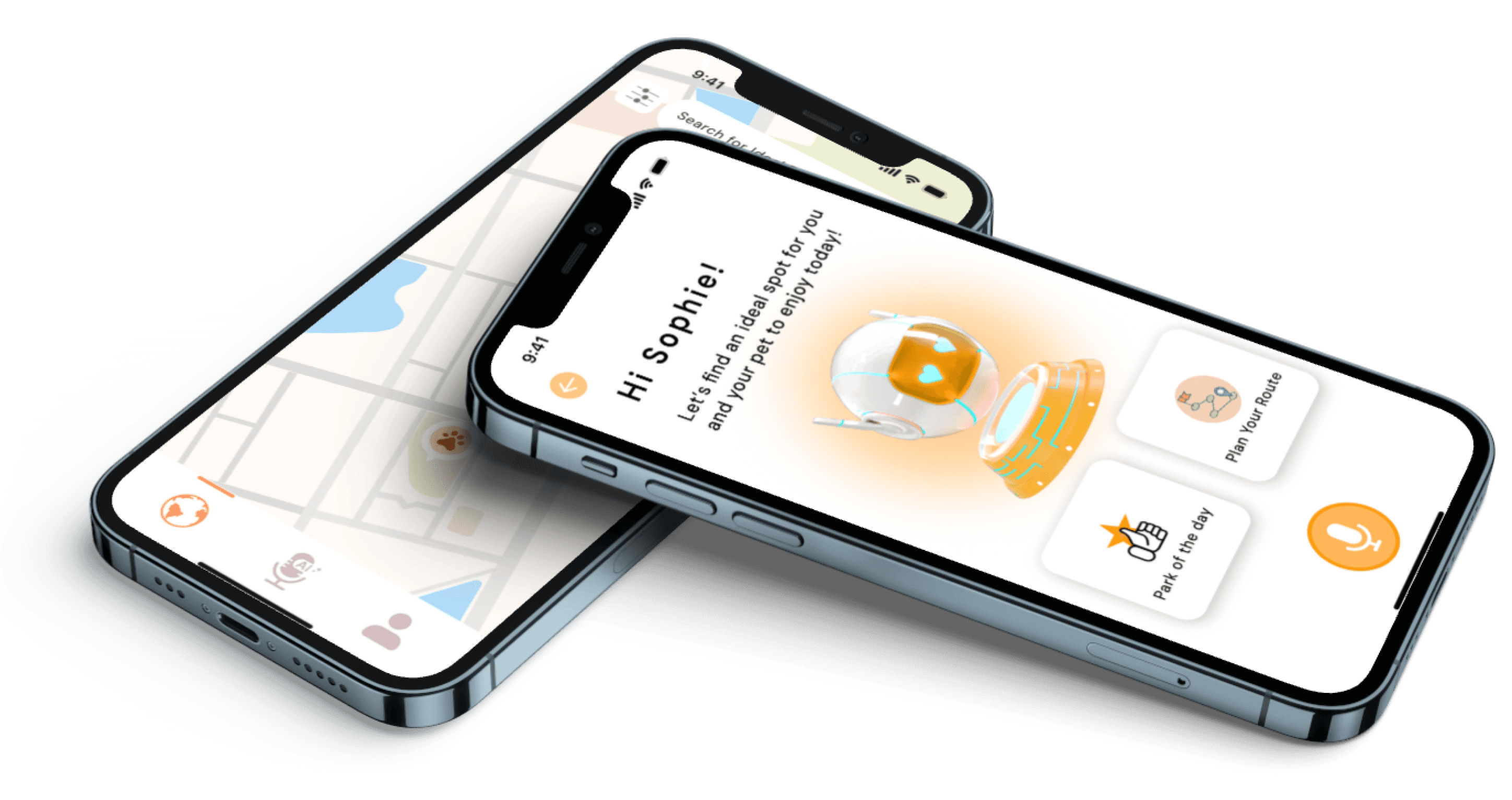
Home Page
We introduced the home screen to provide a central hub for users to start their dog park exploration journey. Users can use the search bar to look for their ideal dog park or view nearby parks directly on the map, represented by paw print markers. A filter button allows users to refine their search based on specific criteria, such as facilities or proximity.
To enhance the user experience, we focused on creating a clean and intuitive interface that makes key functions easily accessible. The map view offers a visual and straightforward way for users to locate nearby parks effortlessly.
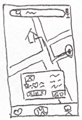
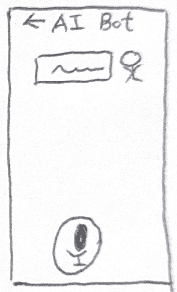
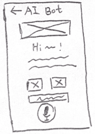
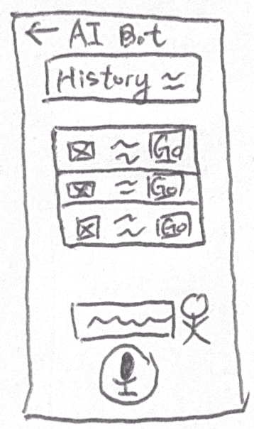
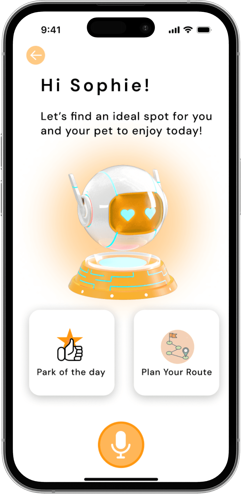
AI Assistant Screen
We designed the AI Assistant screen to provide a more personalized and engaging experience. The AI assistant greets users with a warm message and offers two primary options: “Park of the Day” and “Plan Your Route.” This feature helps users quickly access tailored recommendations or navigate to their chosen destination.
To make the experience feel approachable, we incorporated a friendly, animated AI bot, creating a sense of companionship. This screen aims to simplify daily tasks while offering a hands-free option, particularly useful for users managing multiple items or traveling with their pets.
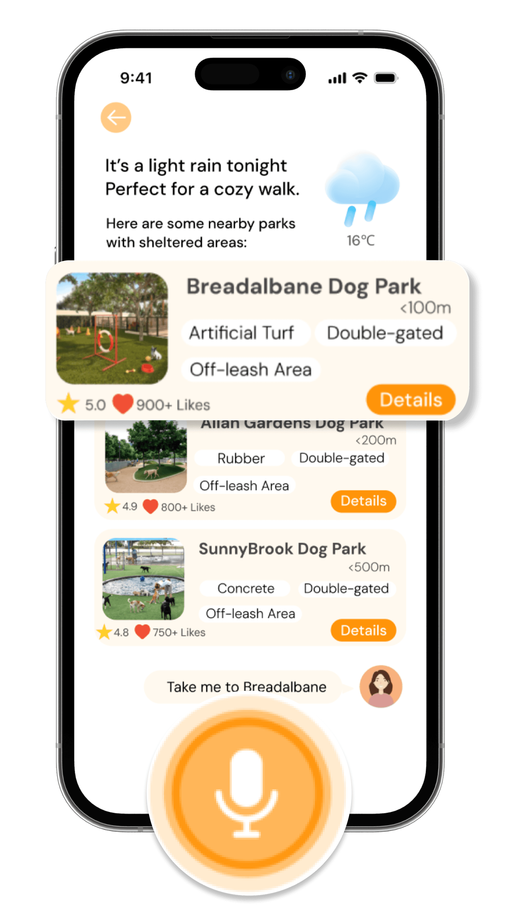
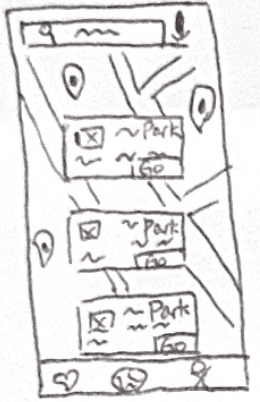
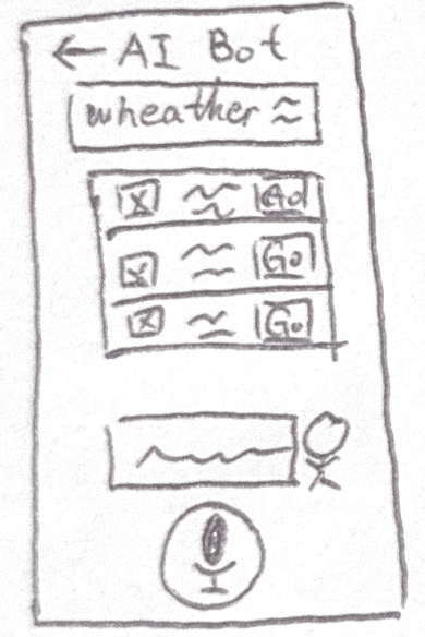
Park of the Day
We introduced the "Park of the Day" screen to provide personalized park suggestions based on weather conditions and user preferences.
offers a hands-free option, making it convenient for users managing their pets or carrying items. This screen is designed to save time and simplify the process of finding suitable parks, aligning with the app’s focus on convenience and personalization.
For example, on rainy days, it highlights nearby parks with sheltered areas to ensure a comfortable experience for users and their pets. Each park listing includes essential details such as distance, amenities, and user ratings, enabling users to make quick and informed decisions.
To enhance usability, we incorporated a clear layout with an emphasis on essential details and a "Details" button for deeper exploration of each park. The voice command feature at the bottom offers a hands-free option, making it convenient for users managing their pets or carrying items. This screen is designed to save time and simplify the process of finding suitable parks, aligning with the app’s focus on convenience and personalization.
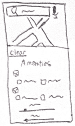
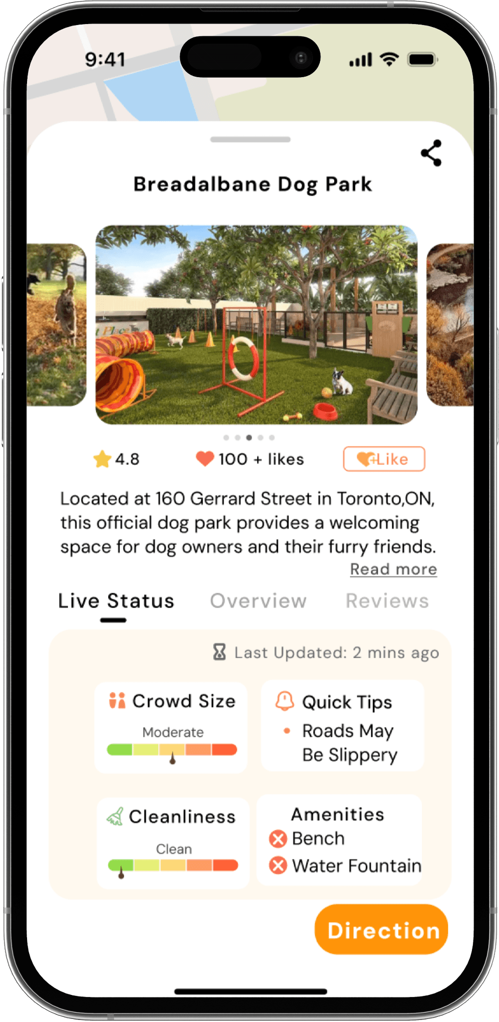
Park Detail Page
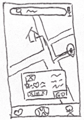
The park details screen offers users a comprehensive overview of the selected dog park. It includes the park’s name, ratings, likes, photo gallery, and live updates such as crowd size and cleanliness. Key amenities are also listed, providing users with the necessary details to decide if the park meets their needs. A “Direction” button allows users to navigate directly from this page.
We prioritized the clarity of information presentation, combining visuals and text to enhance readability. Real-time data updates build user trust, while interactive features like the “like” button encourage community engagement.
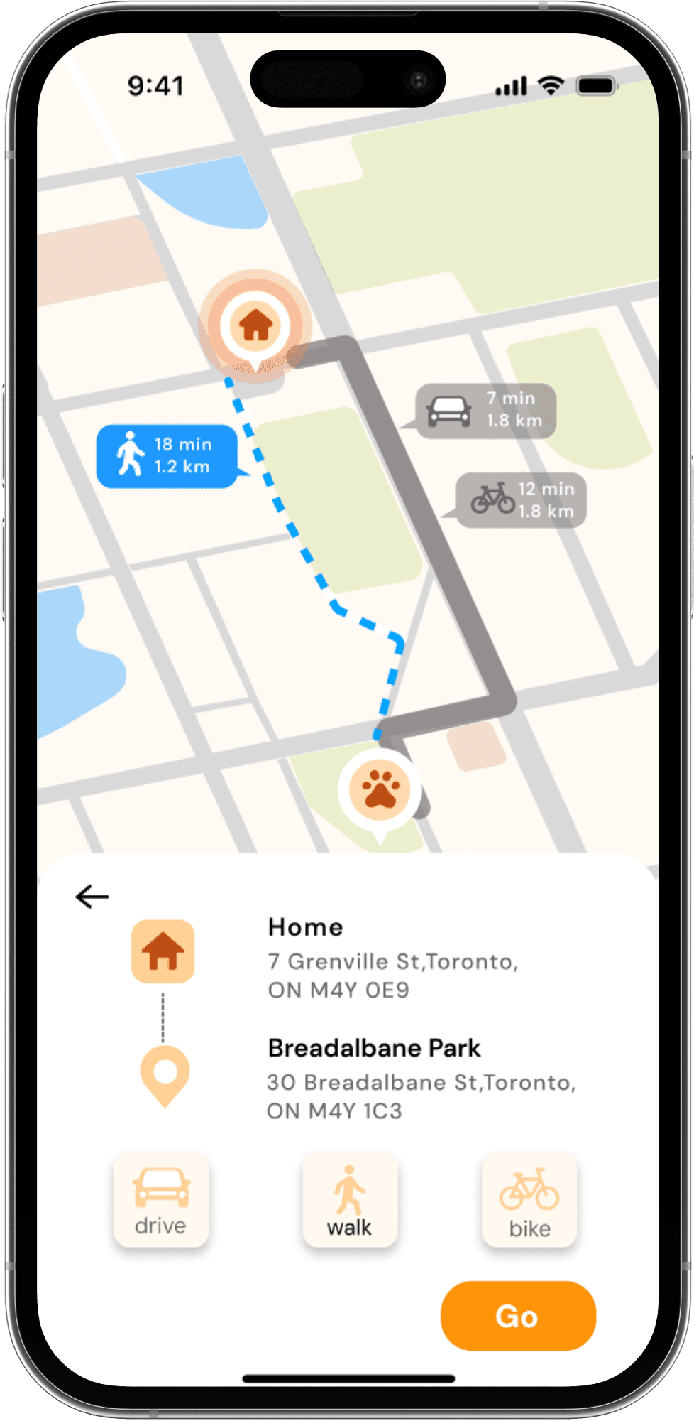
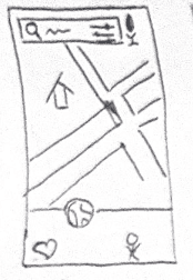
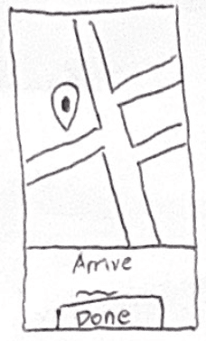
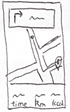
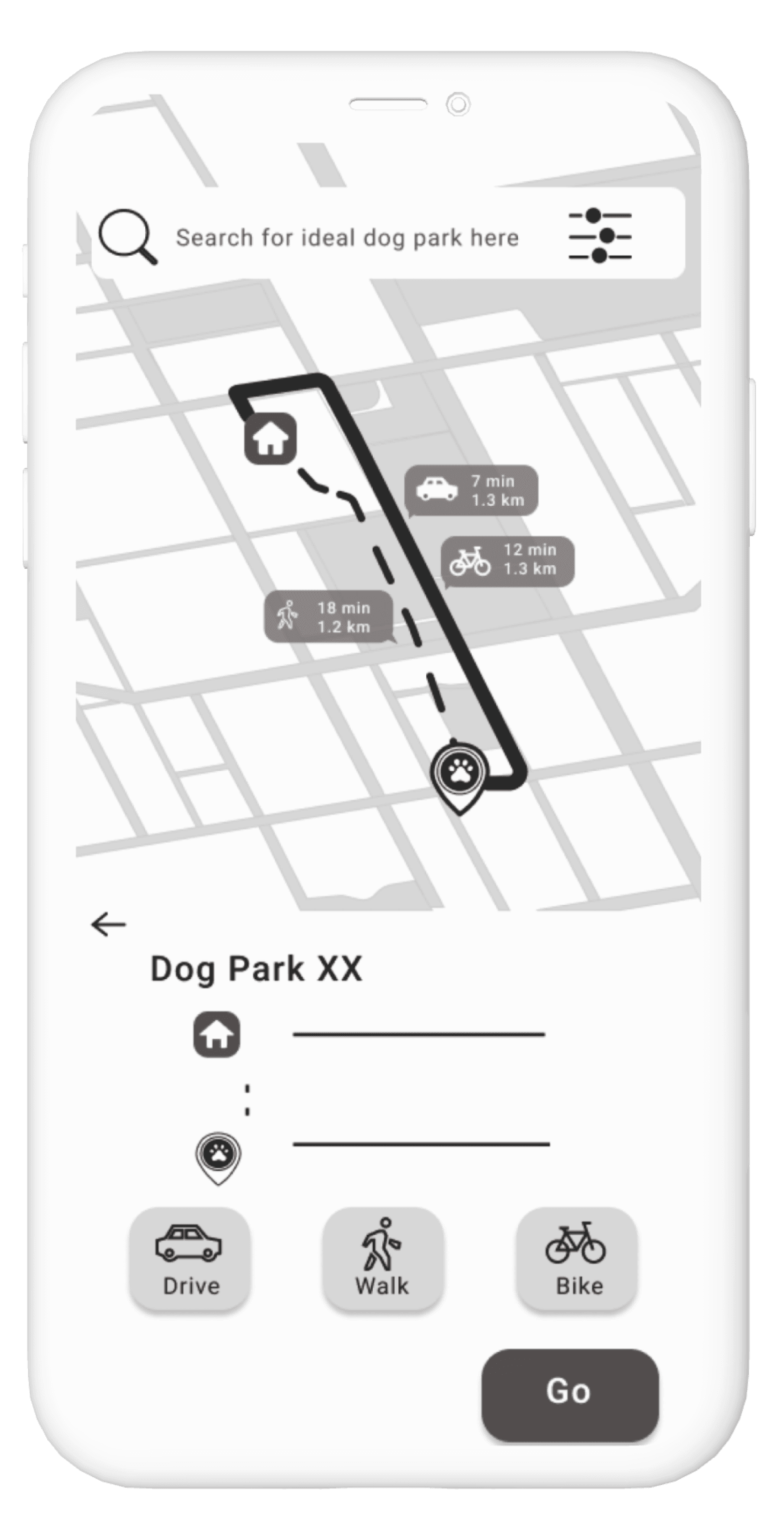
Navigation Screen
The navigation screen provides users with detailed route options to their selected park. It displays multiple transportation methods, such as walking, biking, or driving, with clear time and distance comparisons. At the bottom, users can view both the starting point and destination addresses, along with a “Go” button to initiate navigation.
We focused on delivering a visually guided route planning experience, enabling users to quickly evaluate their options and make informed decisions. The clean and concise layout ensures users can seamlessly start their journey with minimal effort.
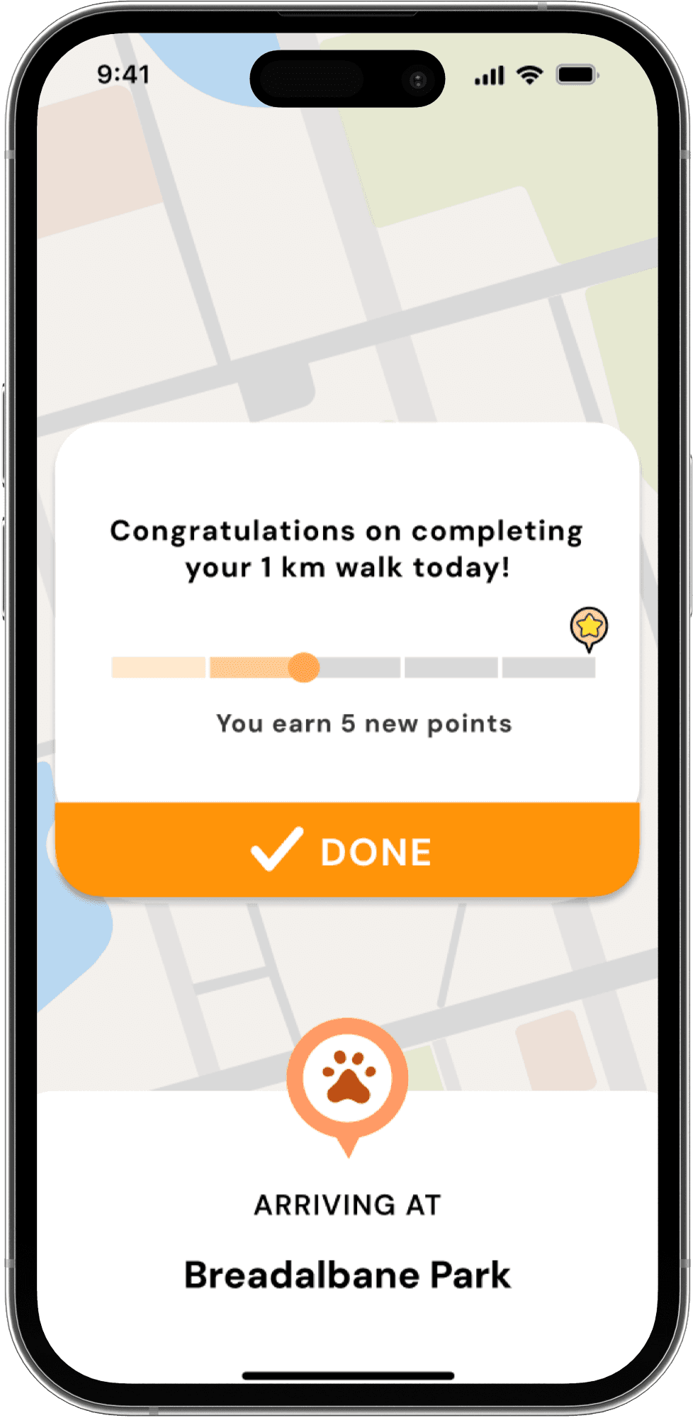
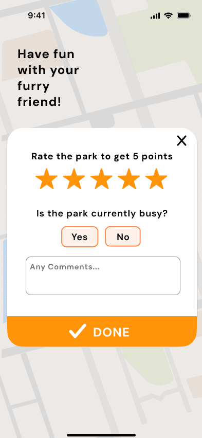
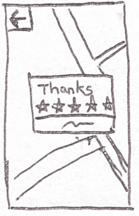
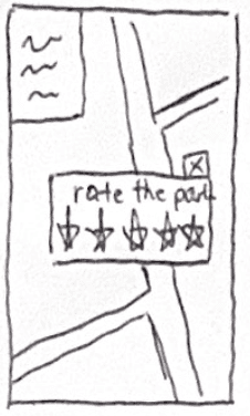
Reward and Feedback
The rate visit screen encourages users to provide feedback after their visit. Users can rate the park with a simple star system, answer whether the park was busy, and leave optional comments. This interactive feedback system fosters a sense of community while improving the accuracy of real-time data for future users.
The design emphasizes simplicity and engagement, using a friendly message like “Have fun with your furry friend!” to create a positive and welcoming experience. By involving users in the feedback process, the app builds a collaborative environment that benefits all.
Contribution
Team Contribution
As a team, we combined individual contributions, reviewing and merging our low-fidelity sketches into a cohesive prototype. This required aligning diverse ideas into a unified design system while ensuring consistency across screens.
For the final high-fidelity mockups, we worked together to standardize colors, typography, and spacing, ensuring a polished and professional look that adhered to the app’s branding and user experience goals.
We collectively conducted usability tests, gathering insights that informed adjustments to navigation, button placements, and feature prioritization.
Feedback revealed the need for features like travel metrics and simplified route selection, which were integrated in the final version.
My Role in the final Design
Design Integration:
I played a key role in merging our designs into a cohesive whole, ensuring the Navigation Screen and In-Route Navigation aligned seamlessly with the overall user flow.
I focused on visual clarity, adjusting layouts and interaction elements for consistency and usability.
Feature Prioritization:
Using user feedback, I prioritized actionable features, such as the “Park Detail Page” providing live status updates and clear directions, ensuring critical information was prominent and easy to access.
Iterative Prototyping:
I worked on refining the navigation flow, ensuring the “Go” button and travel mode selection were intuitive and visually distinct.
My adjustments to the In-Route Navigation incorporated user-requested metrics, such as time, distance, and estimated calorie burn.